Web Design Project
Date: October 2025 – December 2025
Project Type: Individual project
My Role: UX/UI Designer, Front-End Developer, Brand Designer
THE CHALLENGE
“How can a new streetwear brand stand out online while delivering a smooth, responsive shopping experience?
FITSEVERYDAY aims to solve this by merging custom apparel design with a fully developed e-commerce website — built, branded, and launched from scratch.”
About The Project
FITSEVERYDAY is a 14-week e-commerce web design project where I created a fully responsive clothing website from scratch. Inspired by the challenge of building a brand and storefront from the ground up, I designed the entire brand identity, from the logo and apparel graphics to the visual style of the website. The development process blended self-taught coding, AI assistance, YouTube tutorials, pre-built templates. Beyond design and development, I also handled the technical side: purchasing the domain, configuring the C-Panel, and managing the web hosting to successfully launch the live site. Everything was completed under the supervision of Professor Daniel Wong, allowing me to bring both creative direction and technical execution together. The result is a cohesive digital shopping experience that aligns seamlessly with the FITSEVERYDAY brand, casual, clean, and style-forward.
-
I built the FITSEVERYDAY website entirely from scratch using HTML and CSS, with some JavaScript for interactive features. I also handled domain registration, hosting, and CPanel setup to bring the site live.
-
I designed a clean, responsive layout that reflects the brand’s bold streetwear identity. Every page was crafted with usability in mind — from product displays to navigation — ensuring a smooth shopping experience across devices.
-
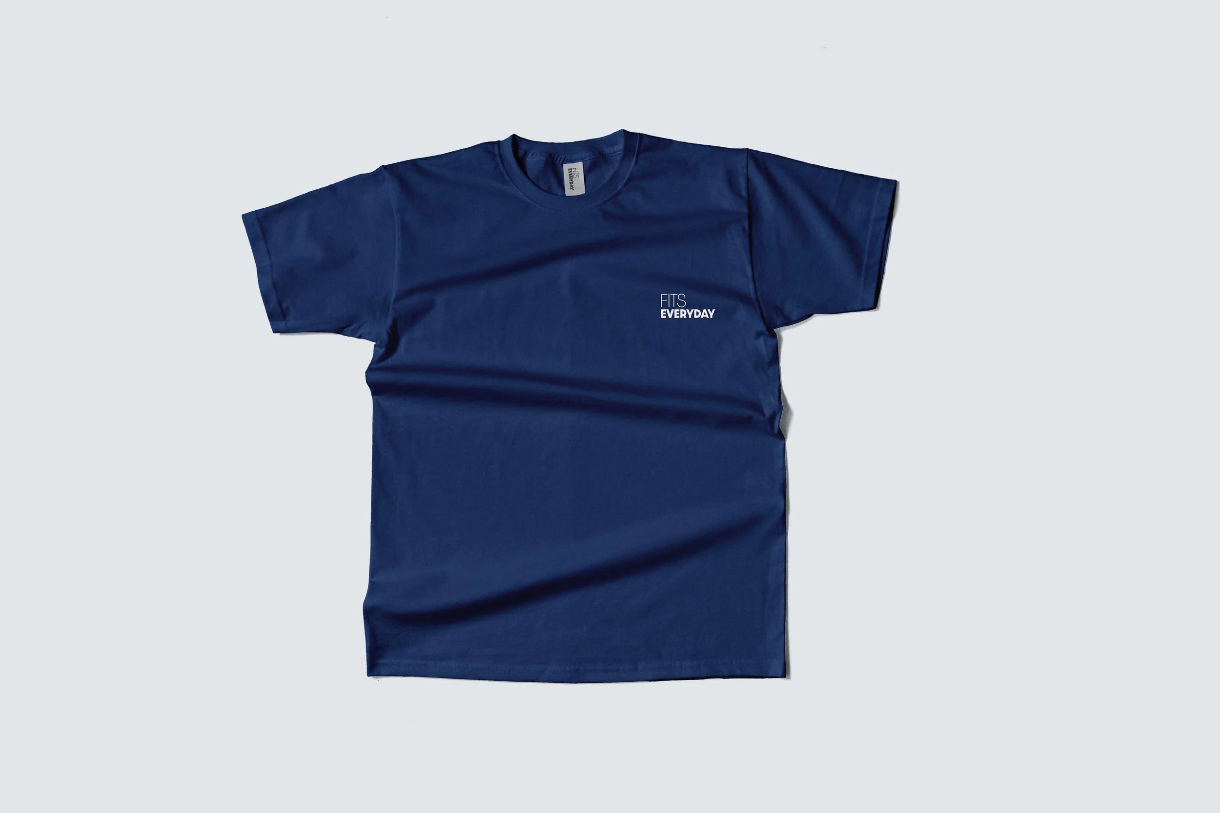
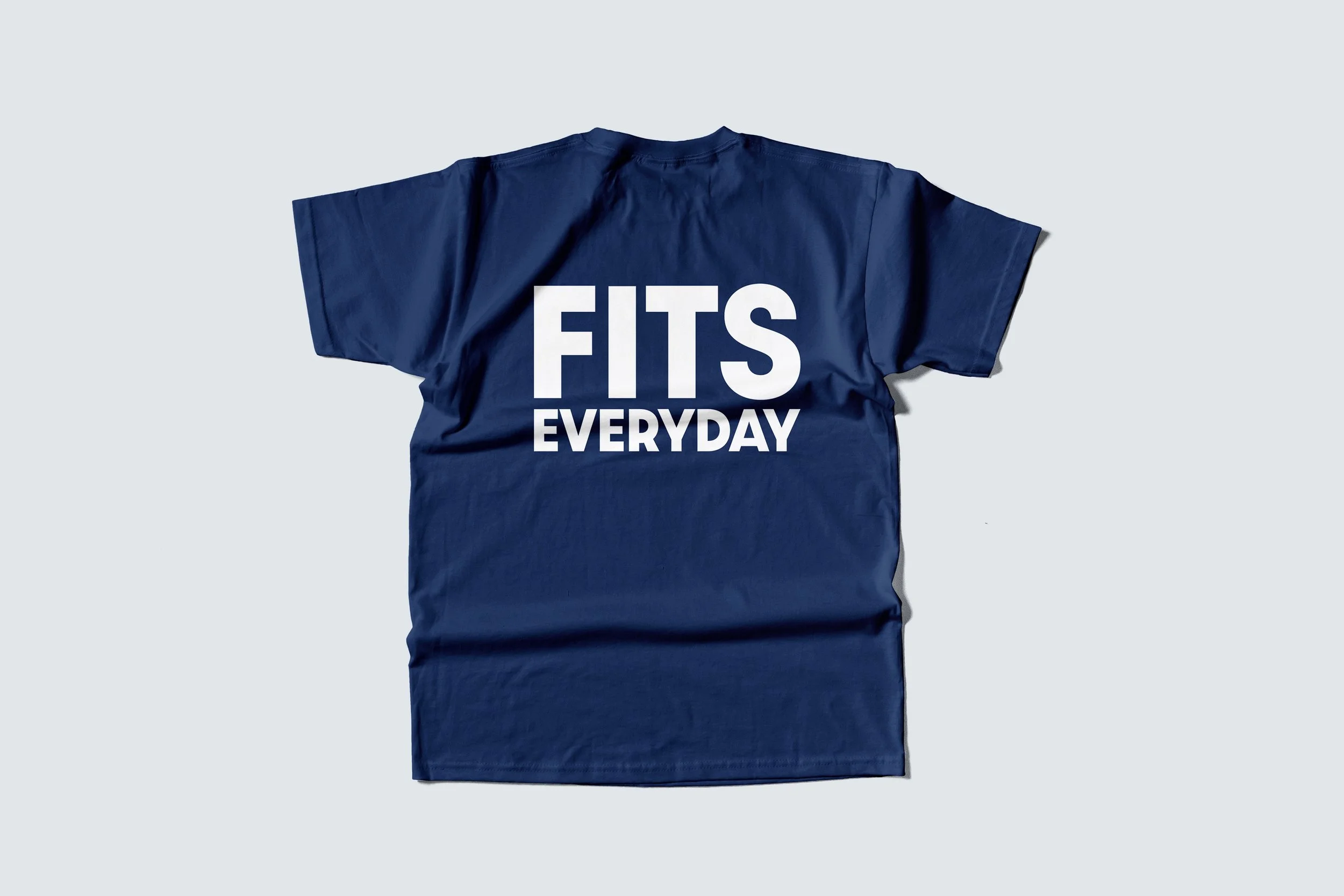
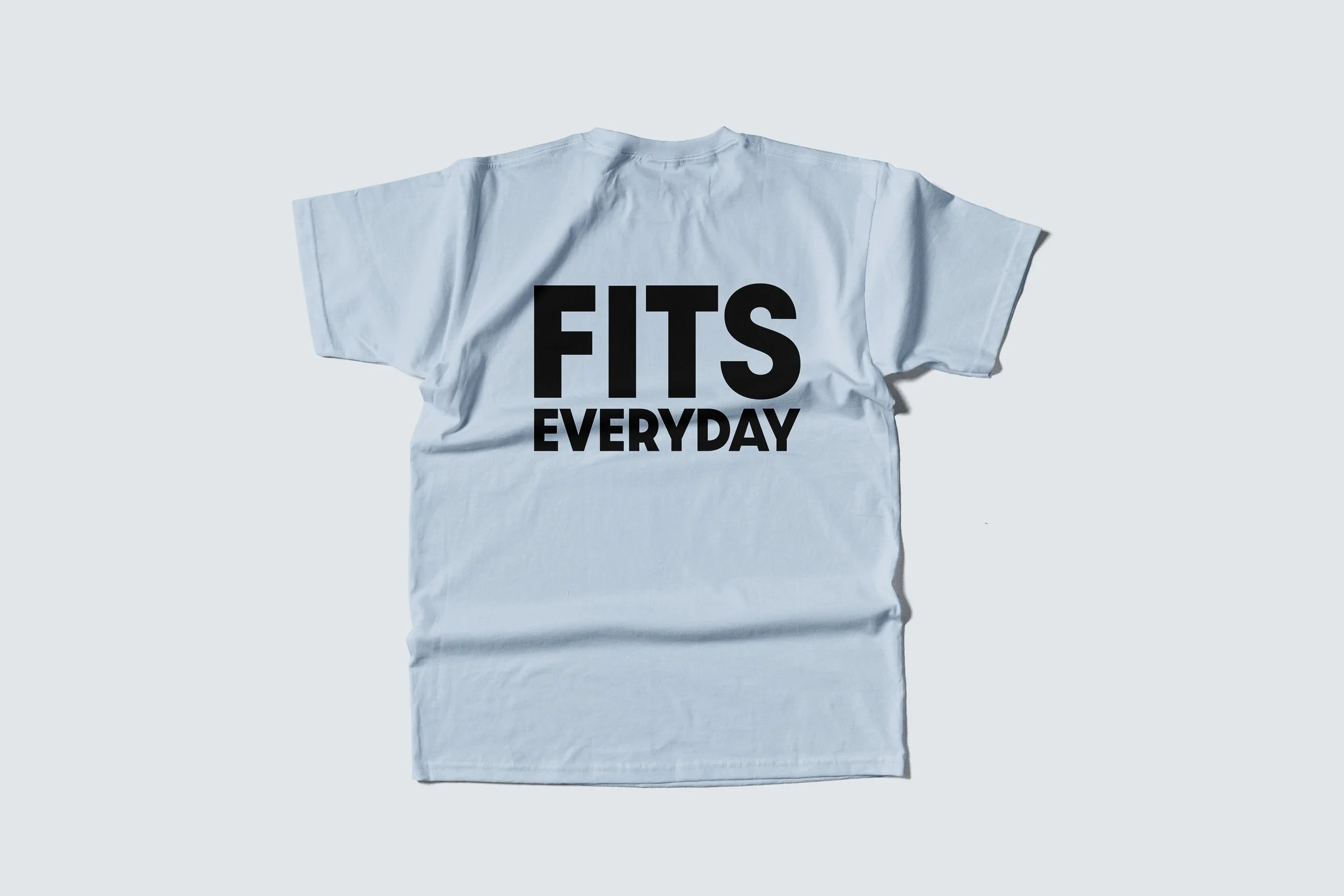
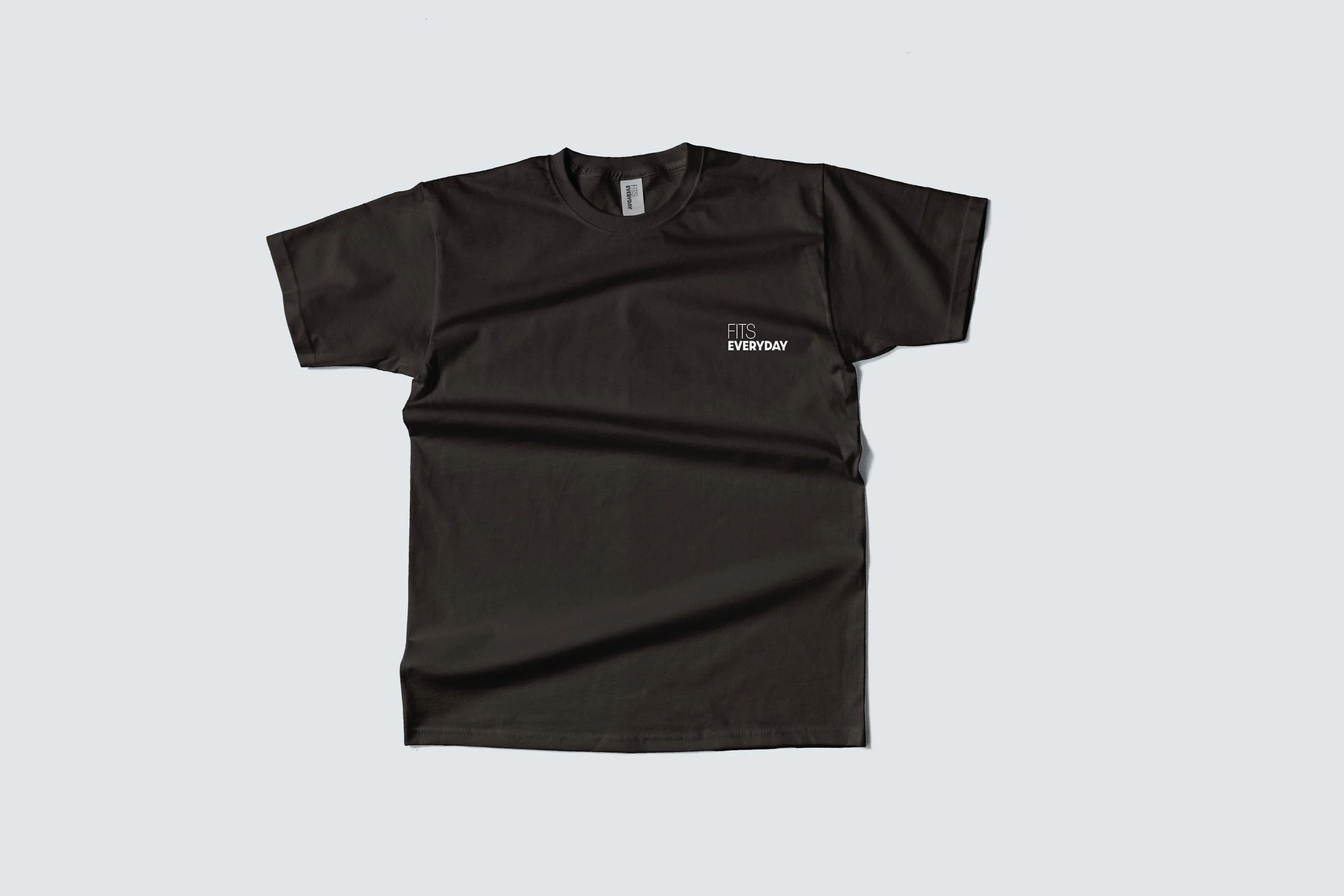
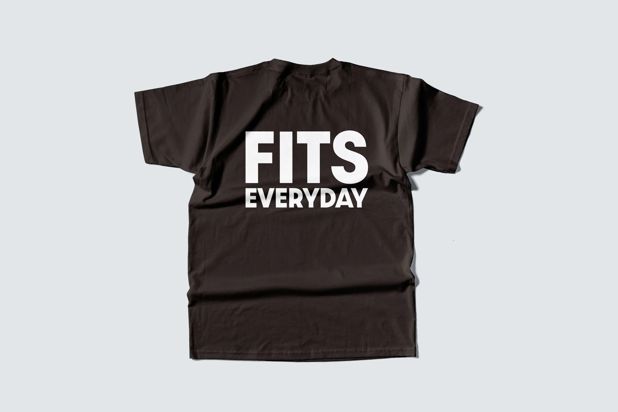
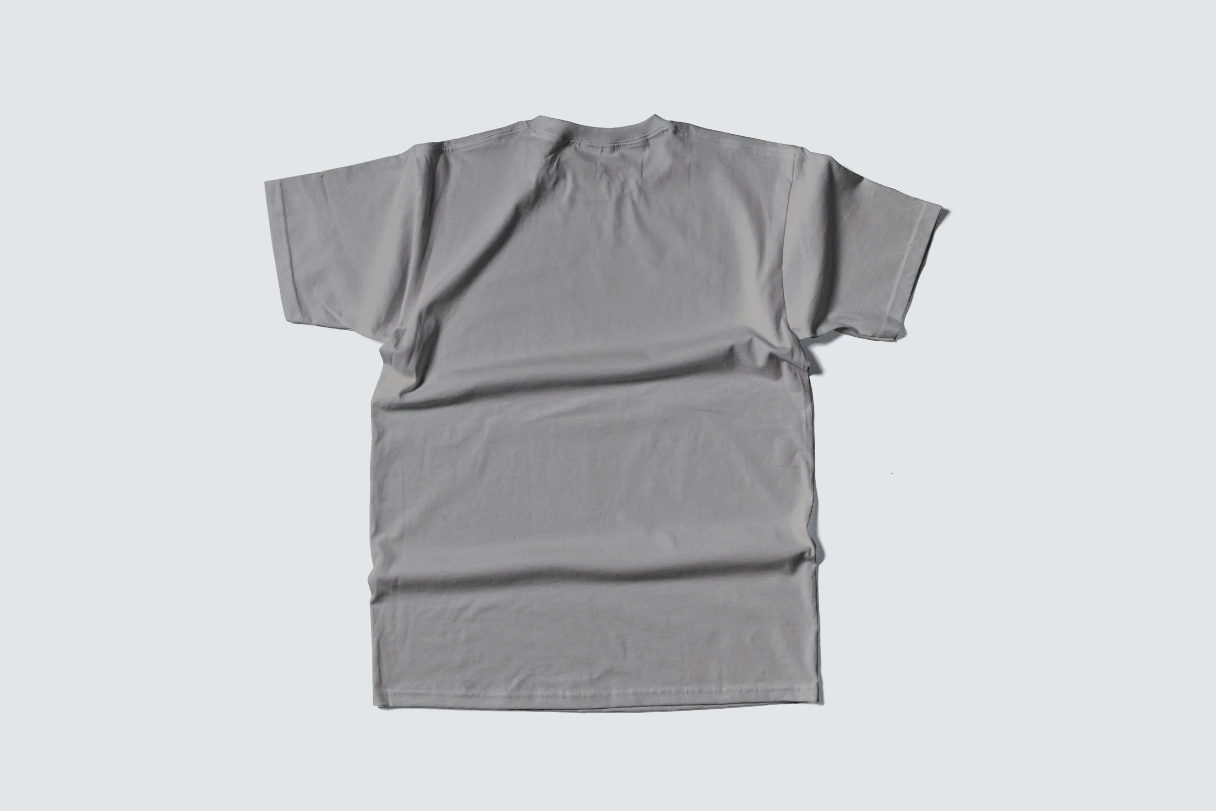
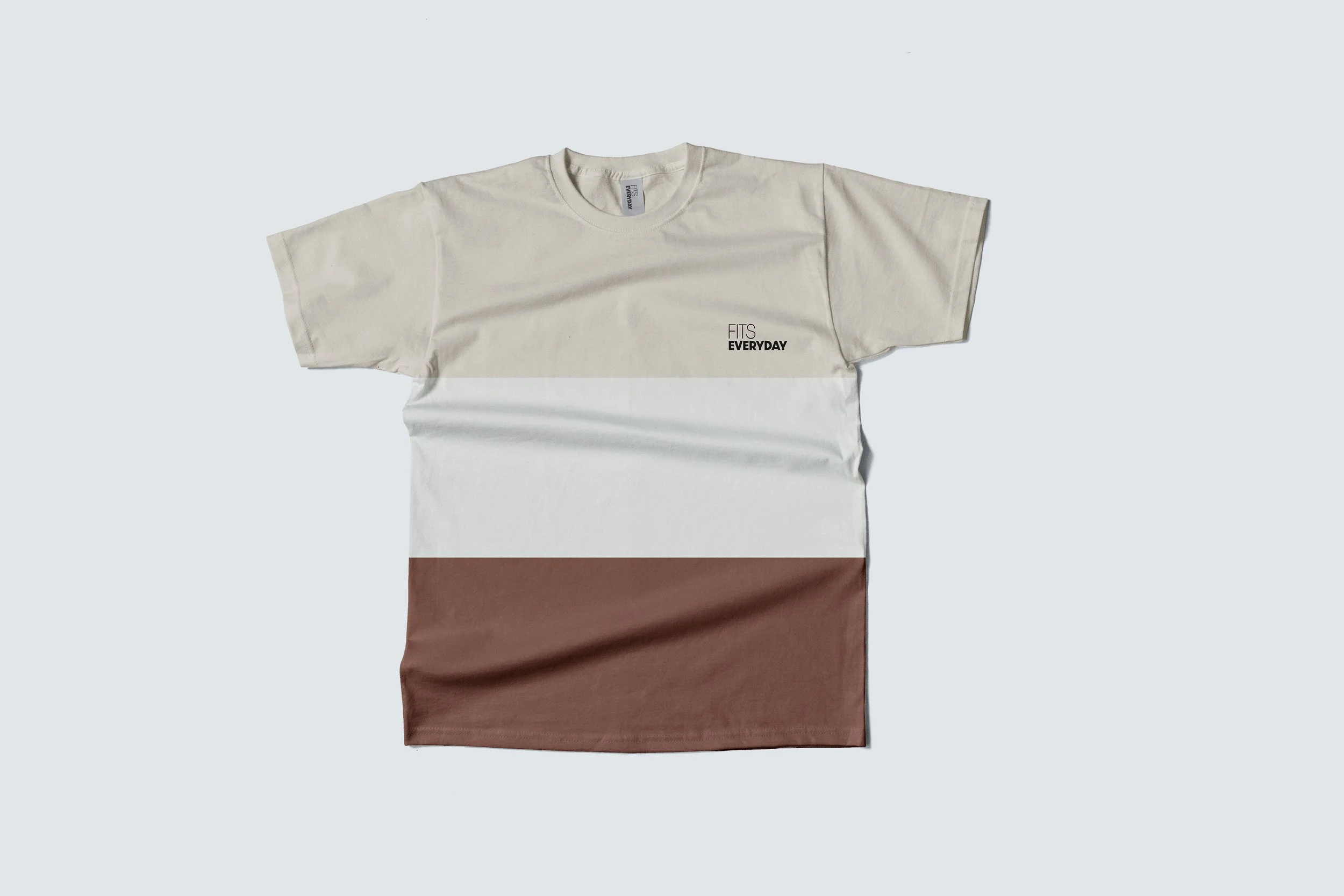
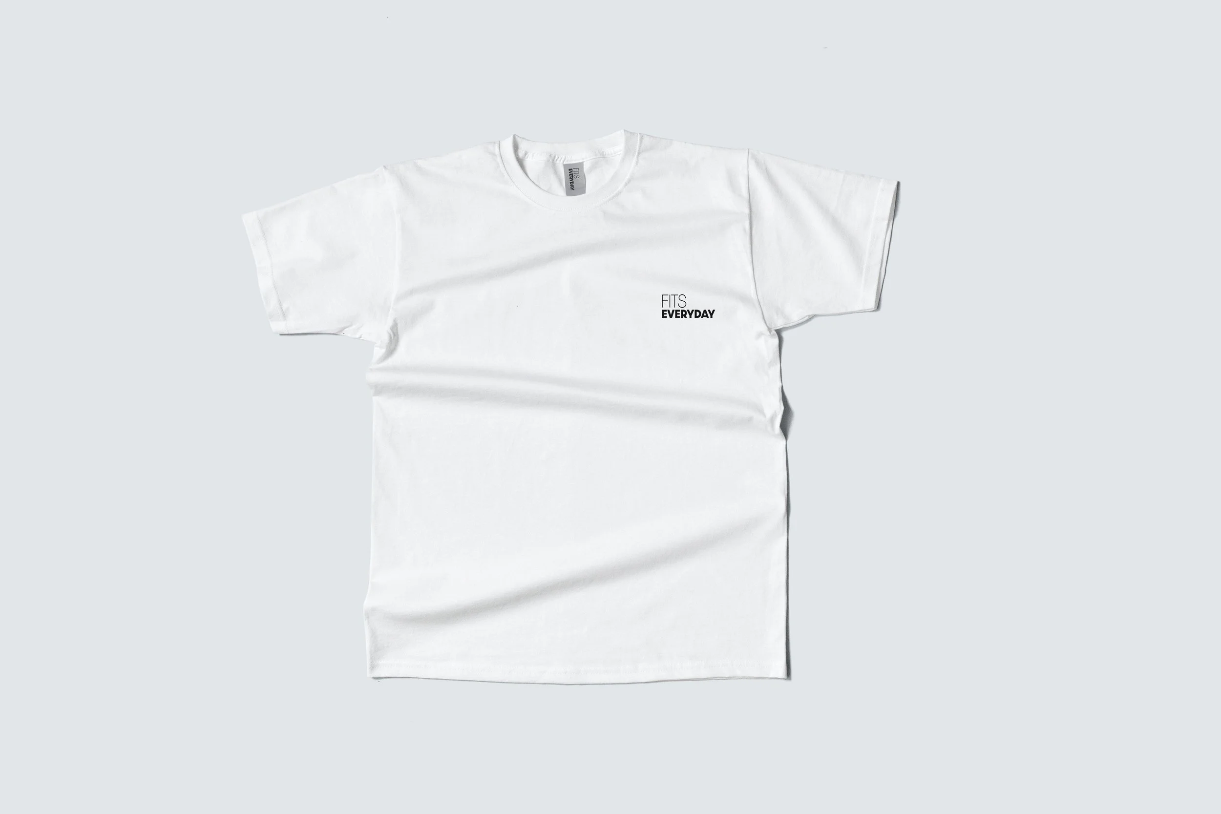
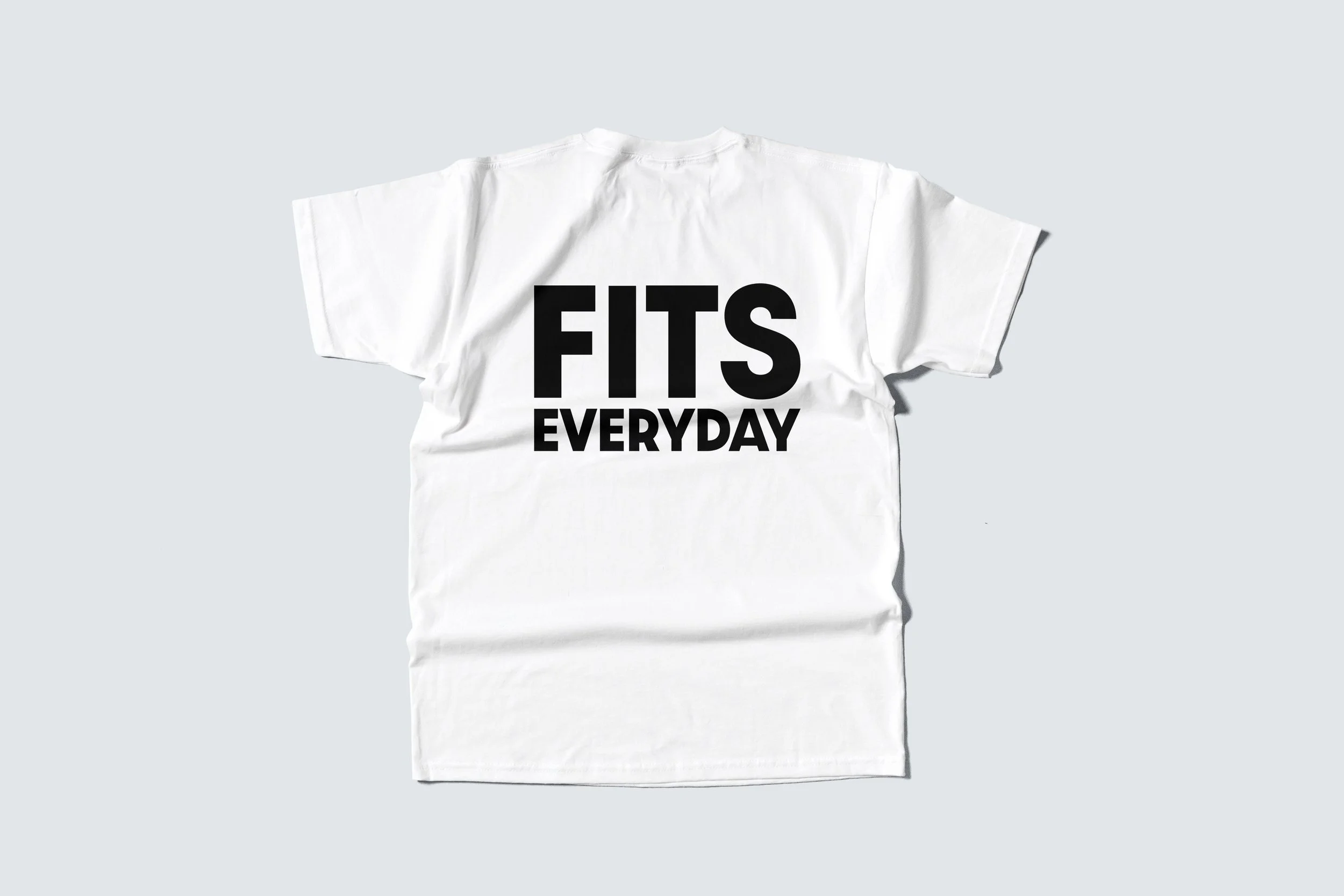
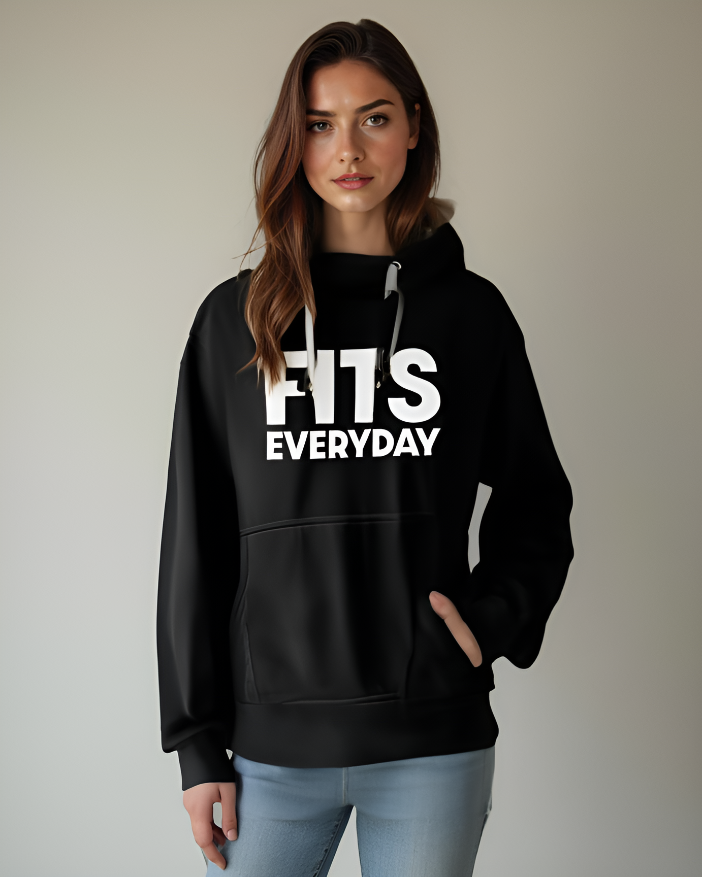
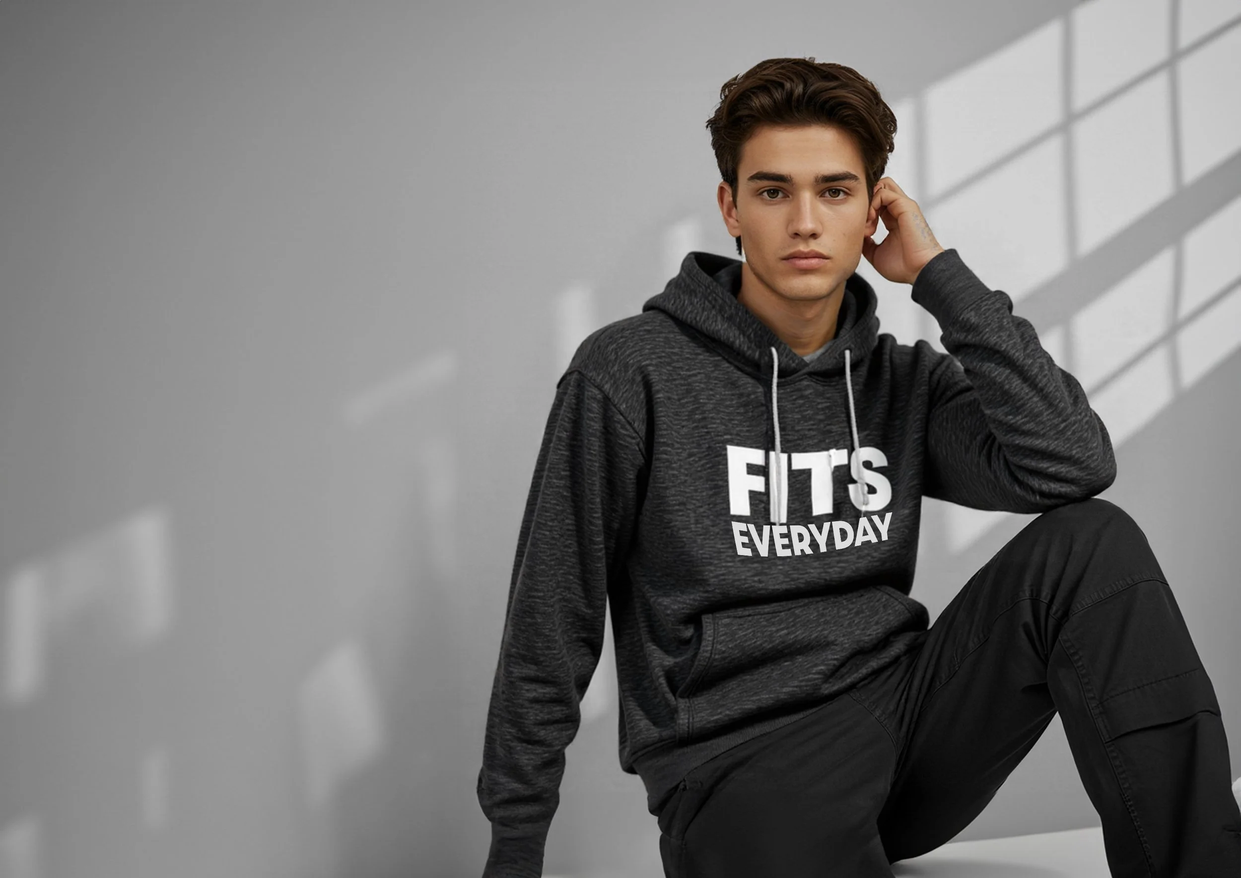
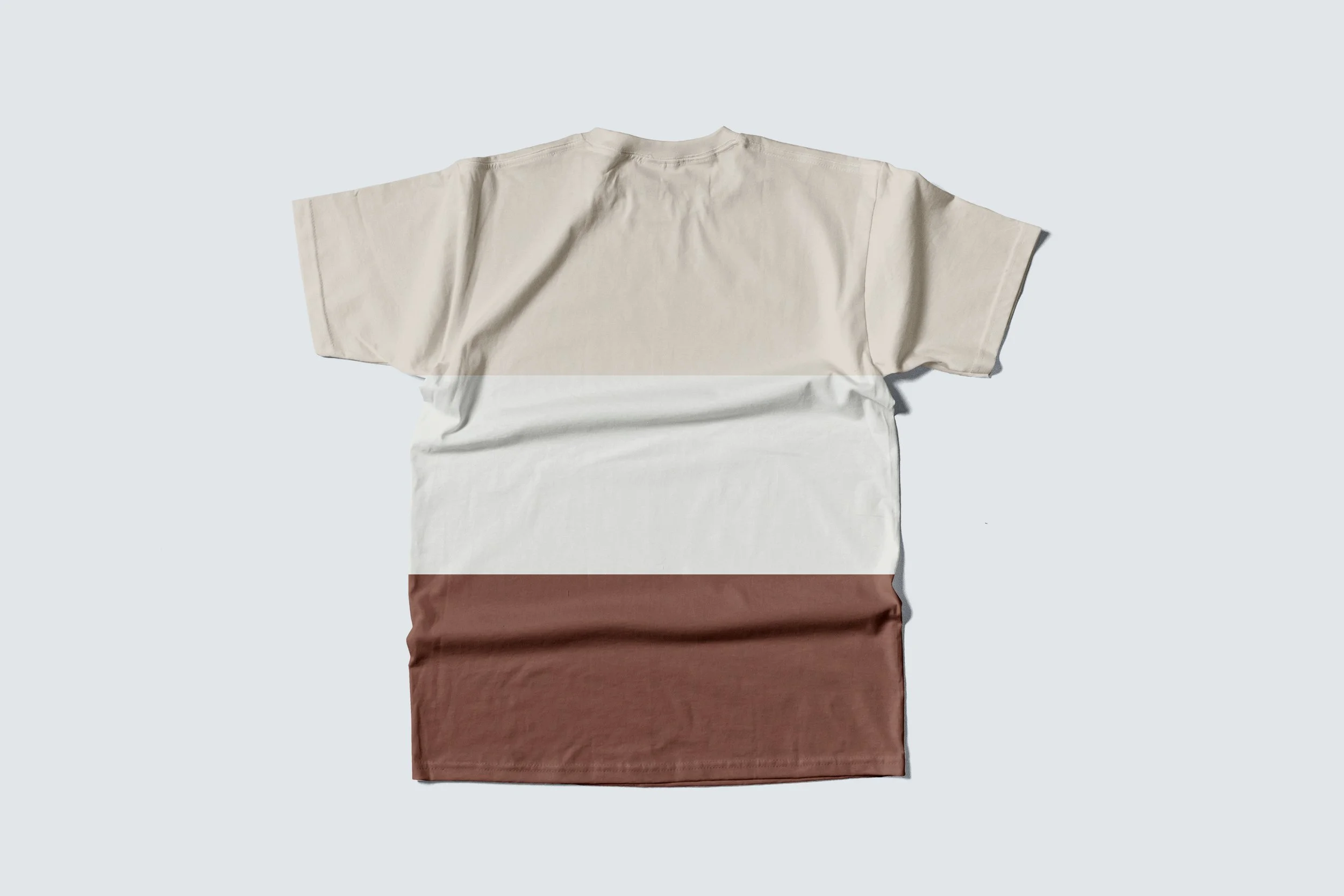
I created the FITSEVERYDAY brand identity, including the logo, typography, and visual tone. I also designed custom apparel mockups (hoodies, tees) and integrated them into the site to build a cohesive look and feel.
Starting with some quick Figma sketches
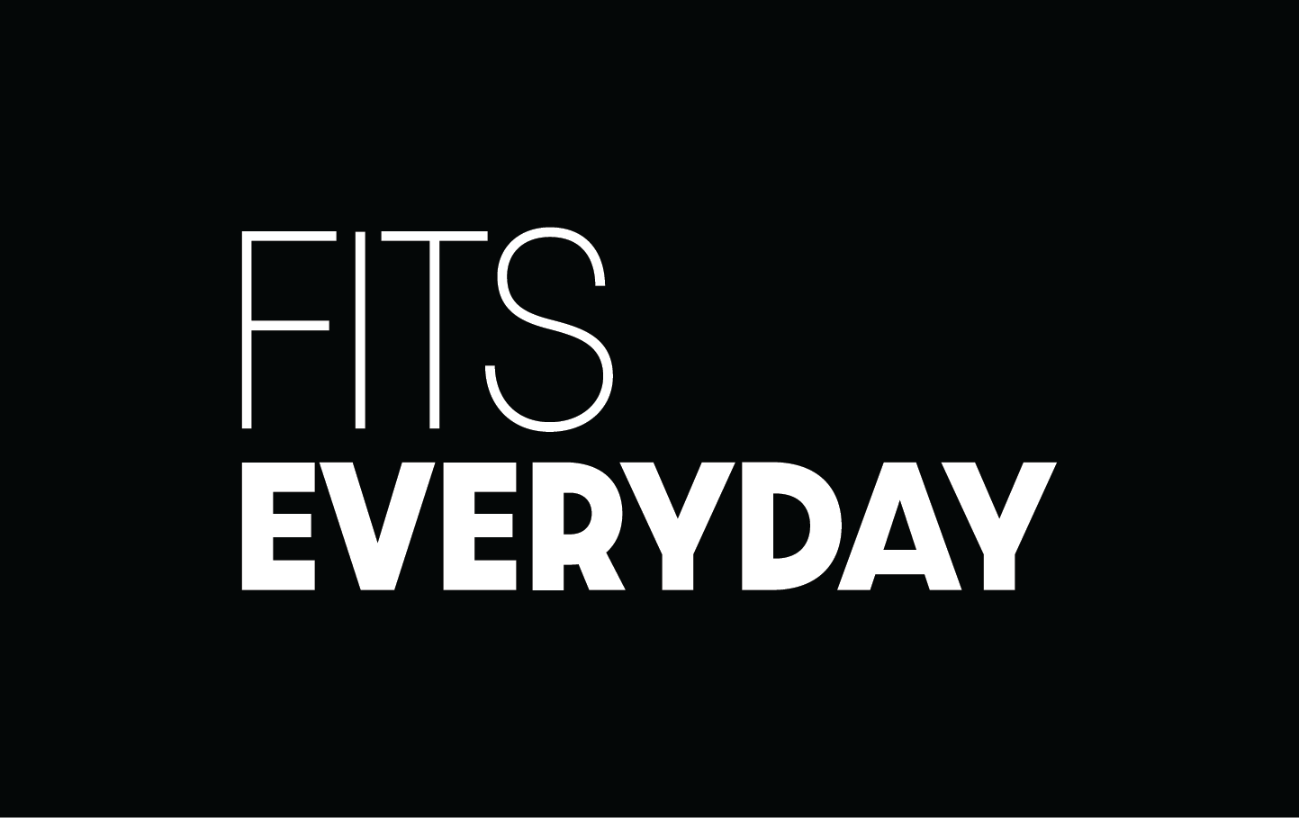
Building the FITSEVERYDAY Brand Identity and Logo
Then I started developing the website alongside designing mockups for the clothing line.
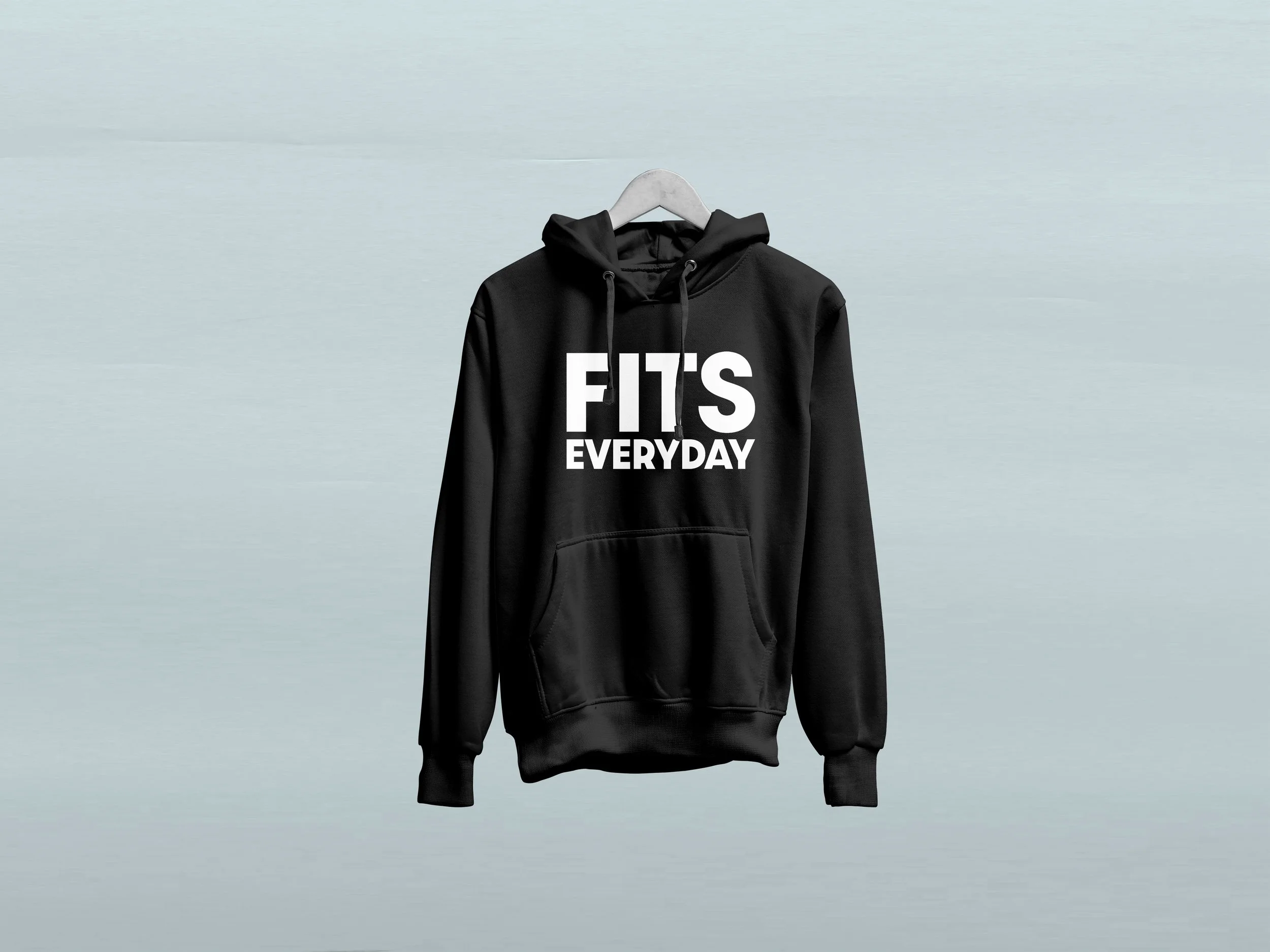
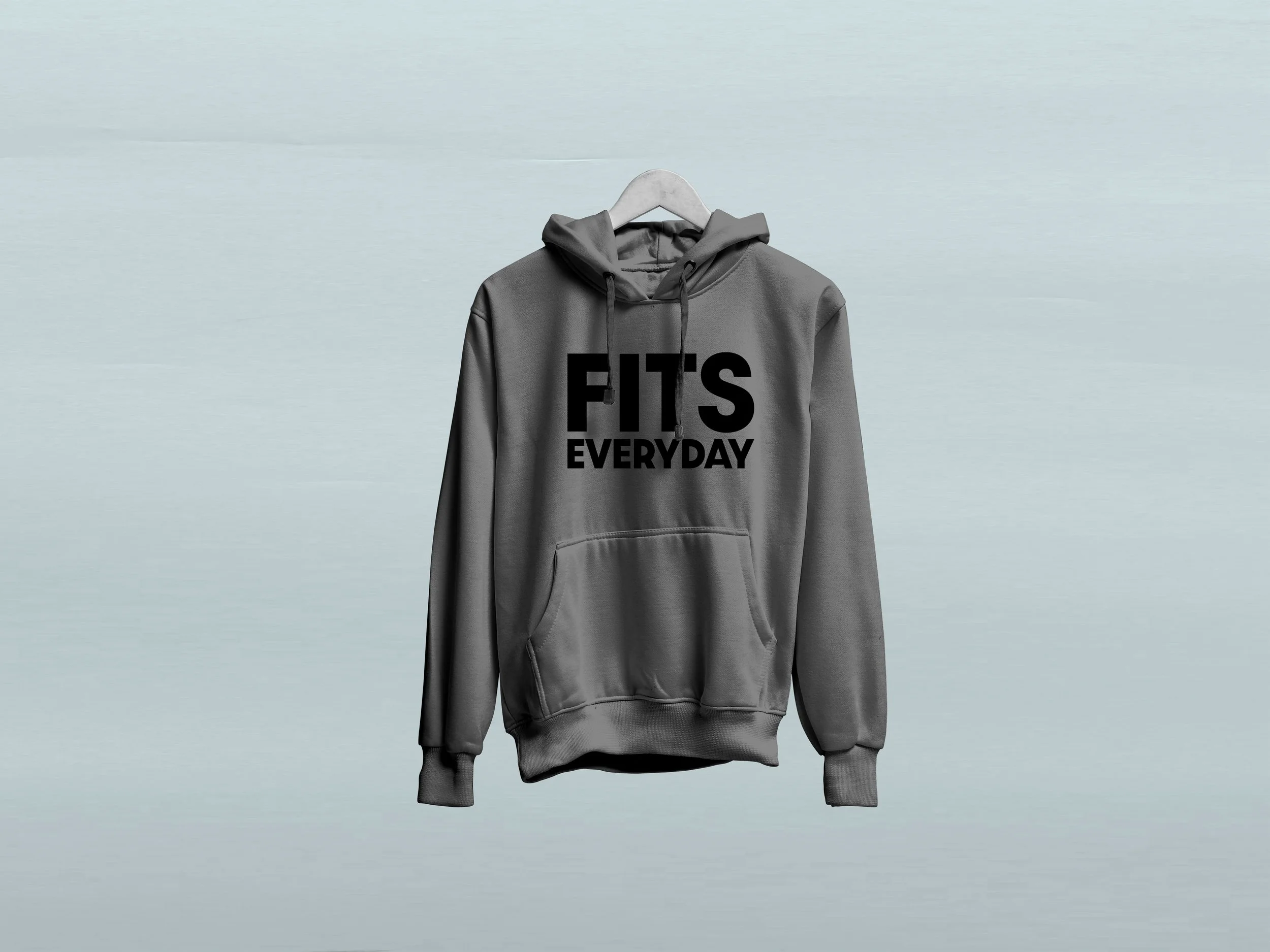
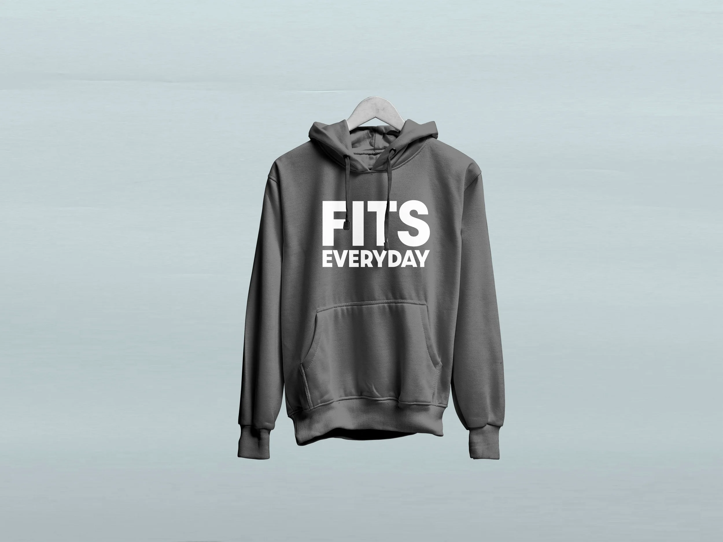
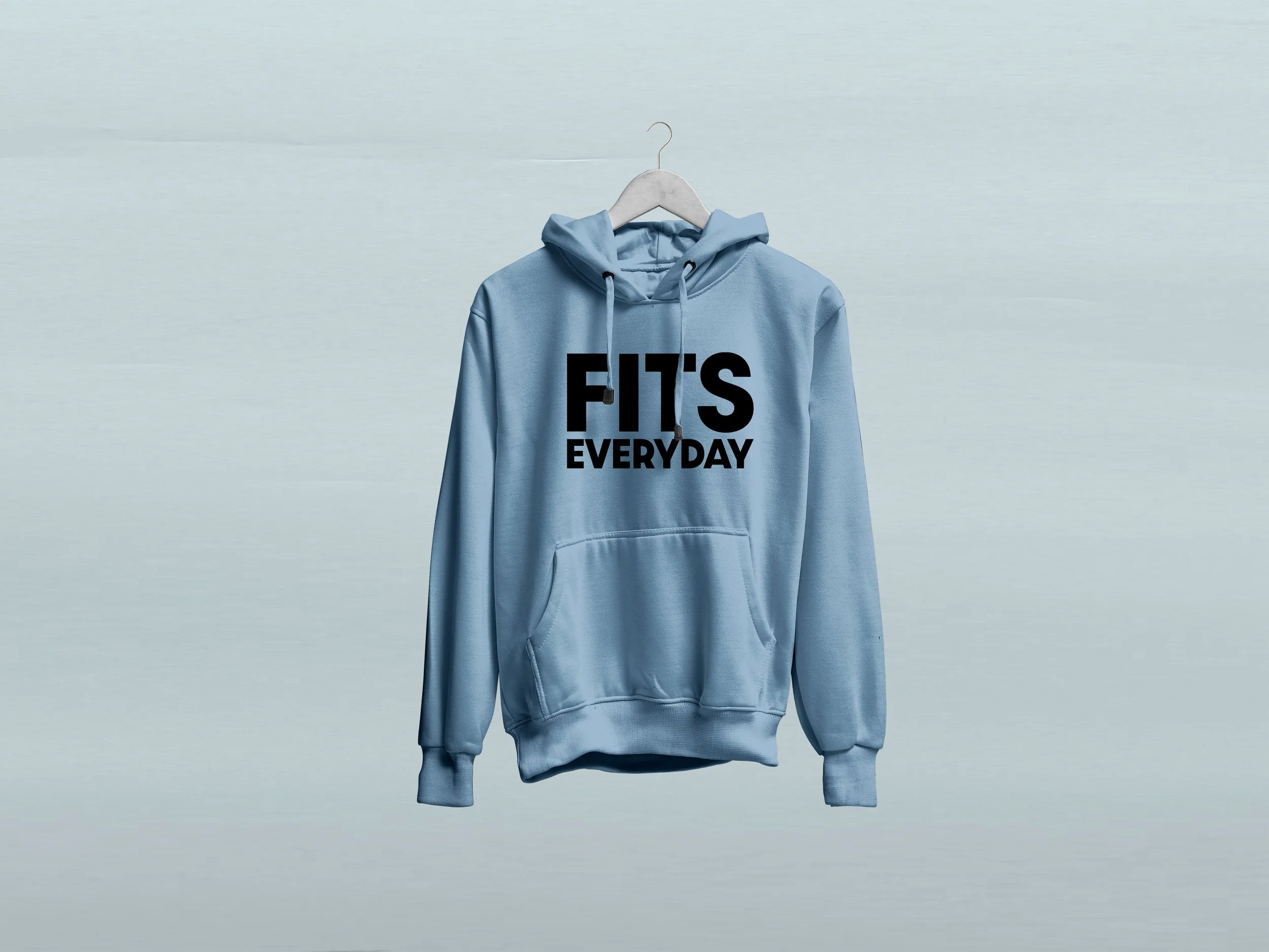
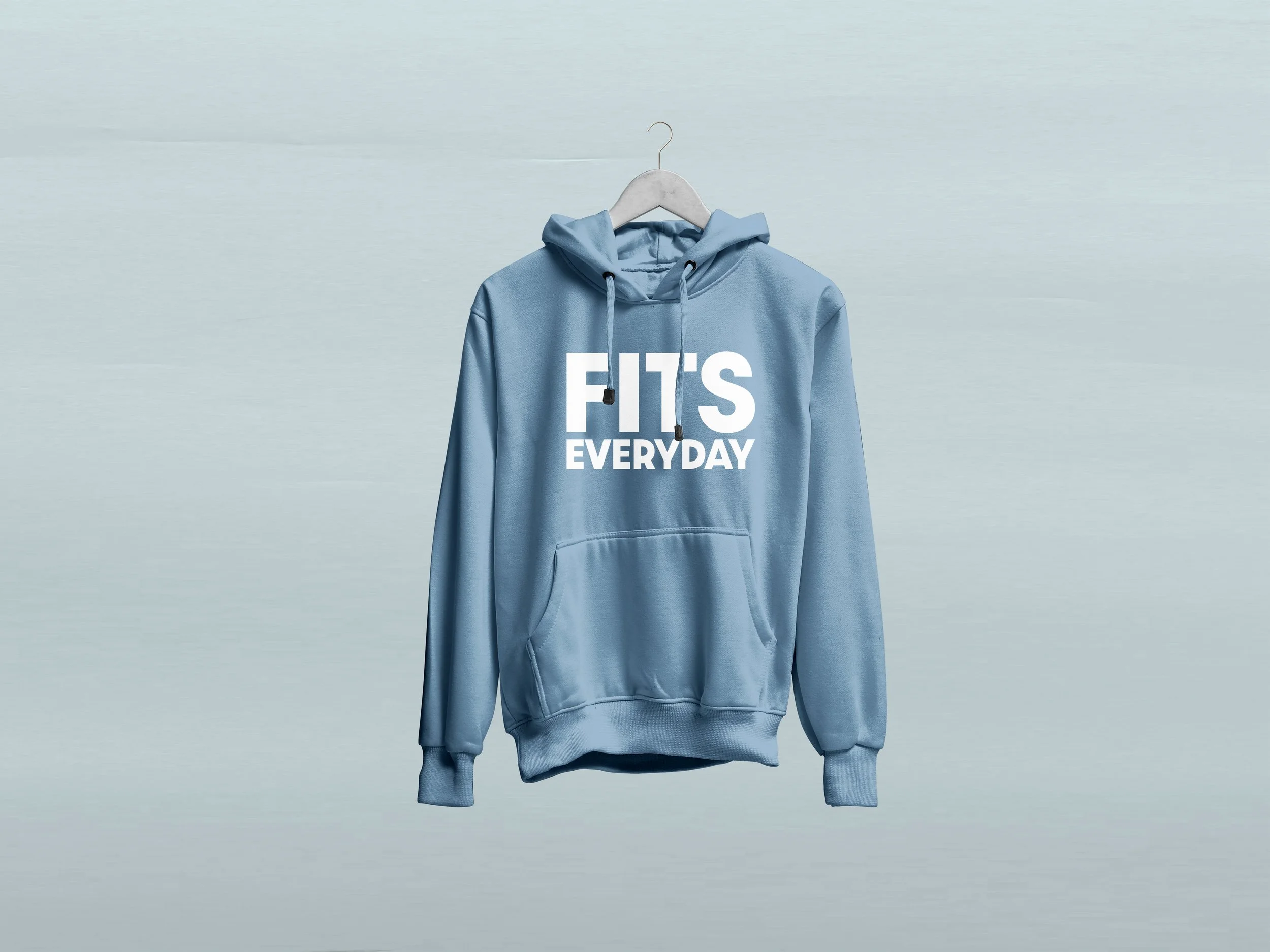
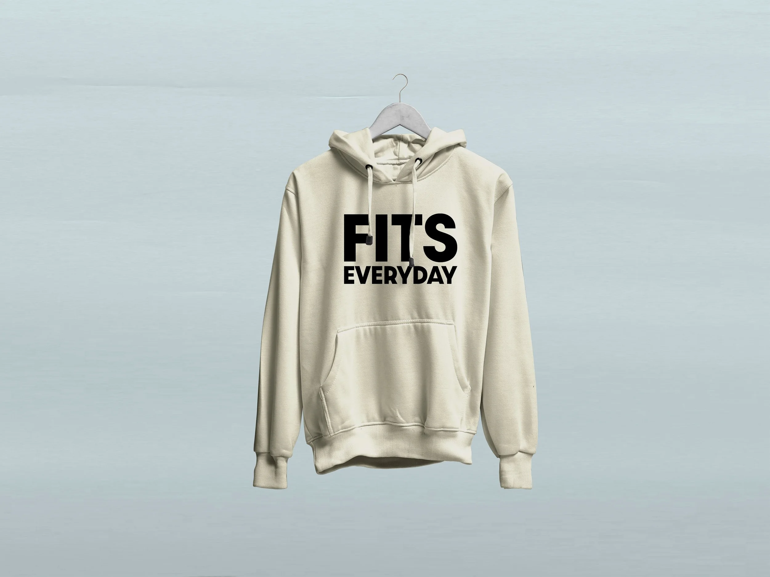
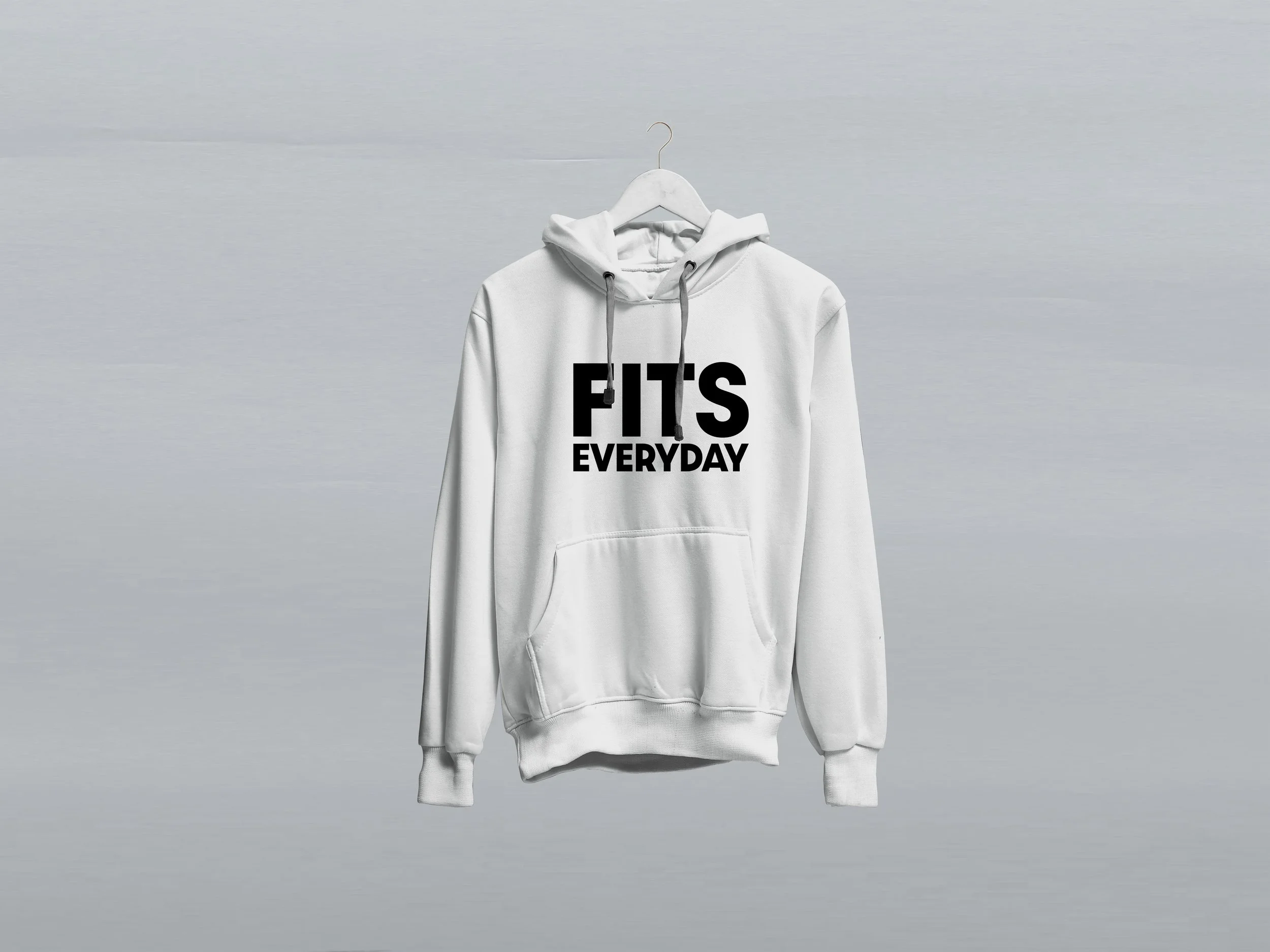
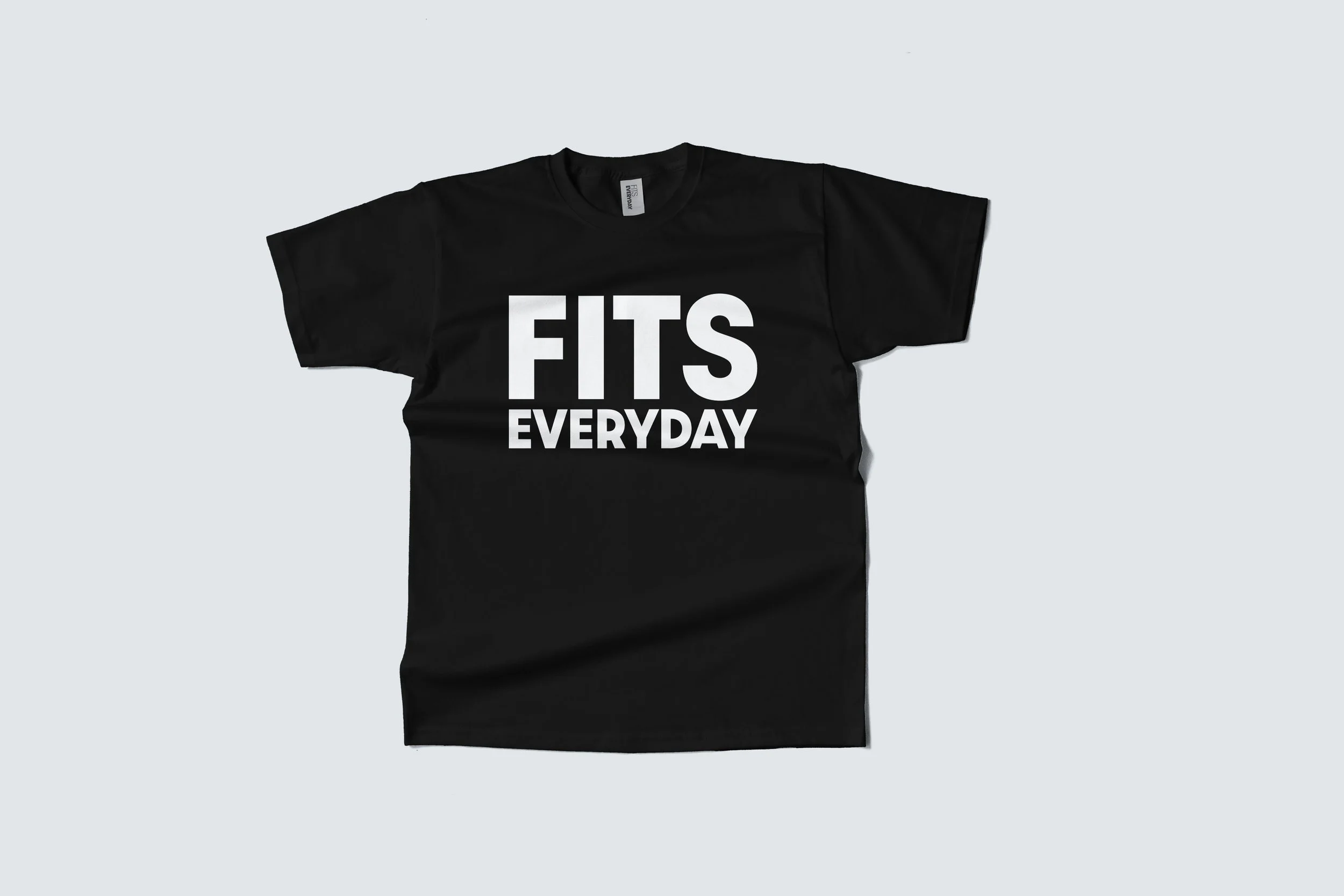
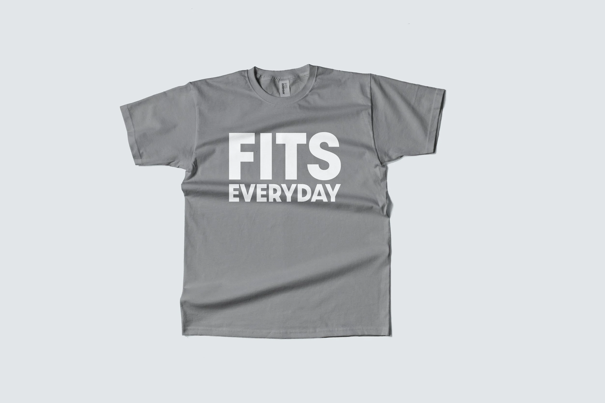

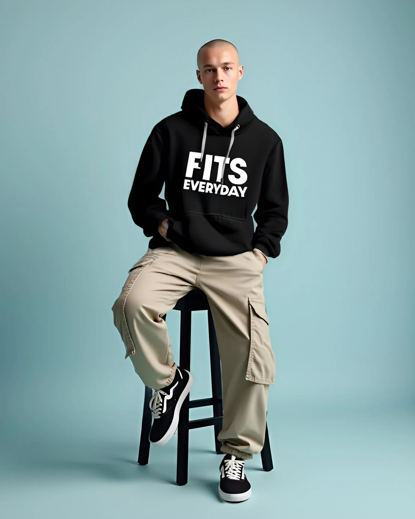
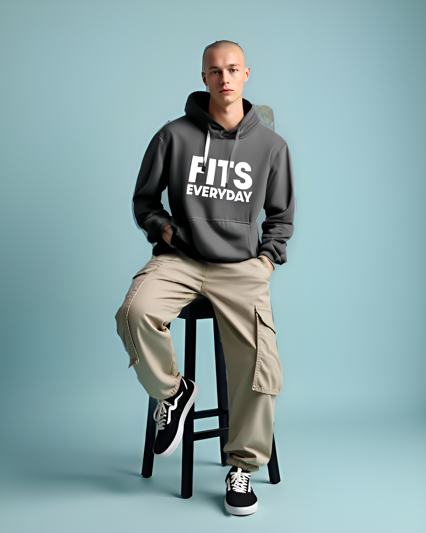
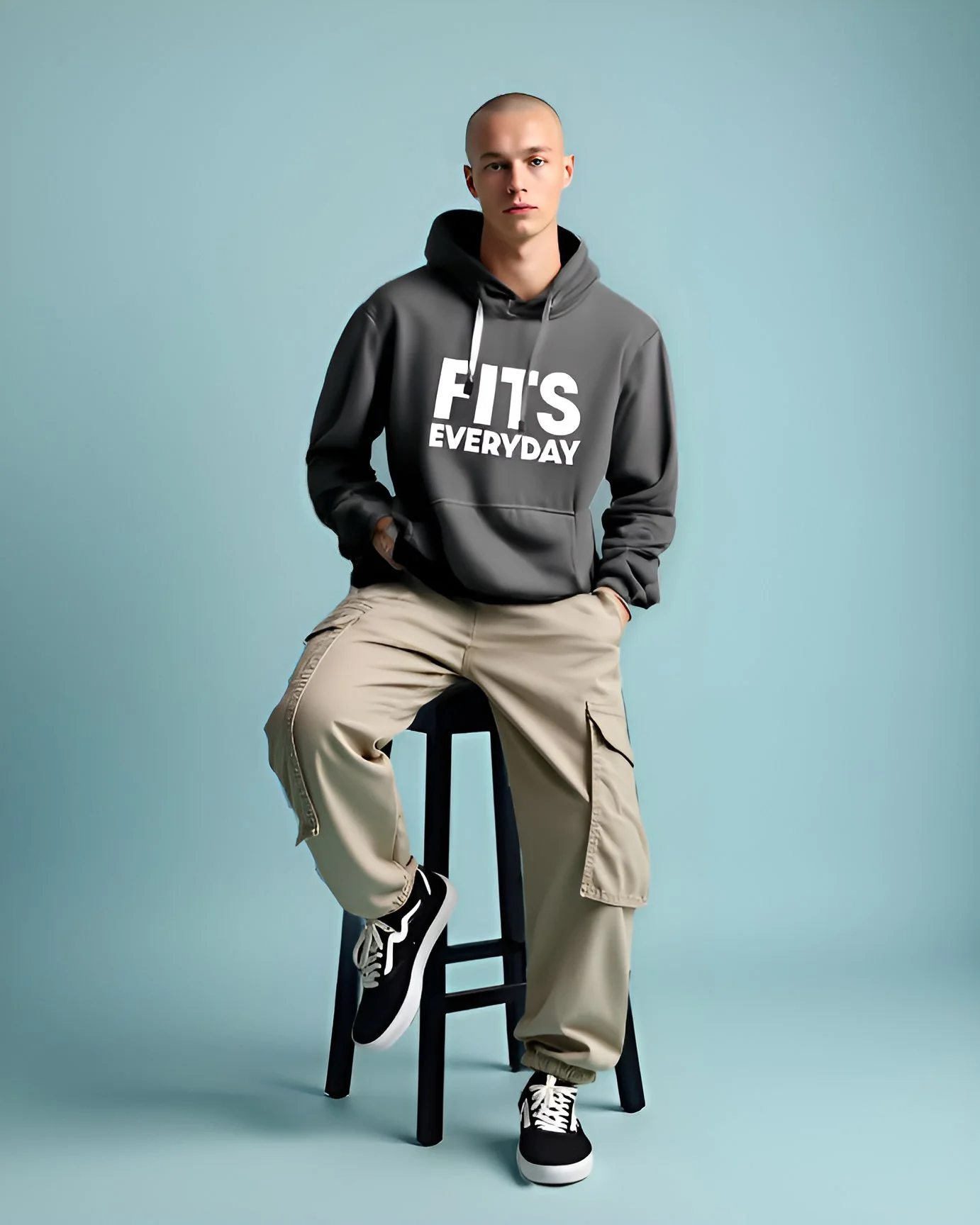
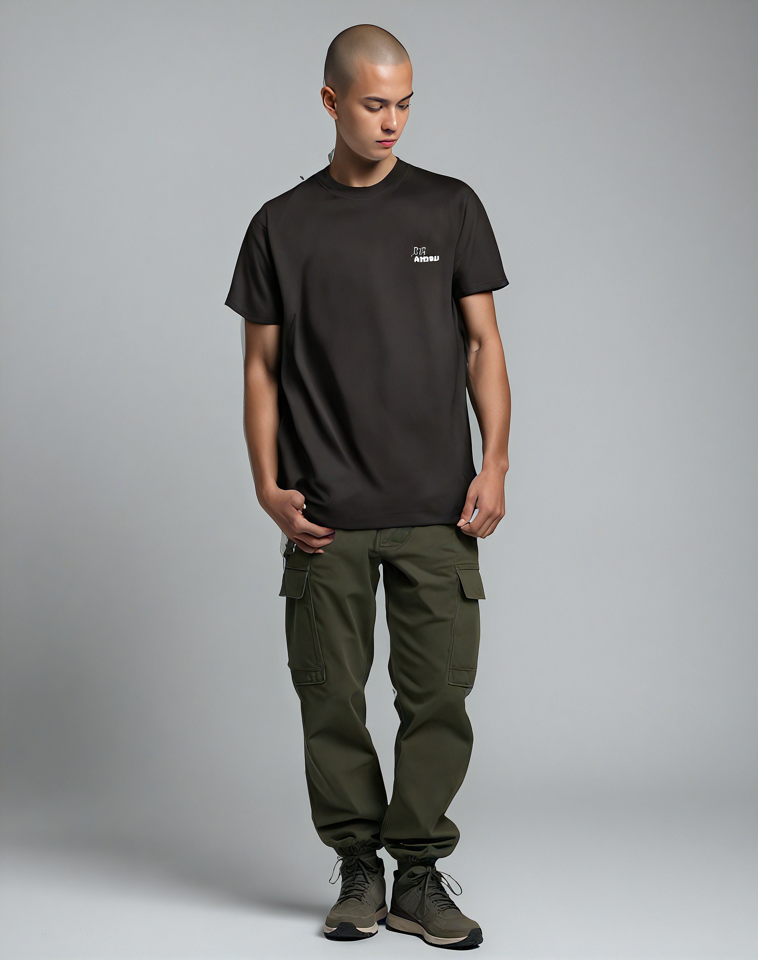
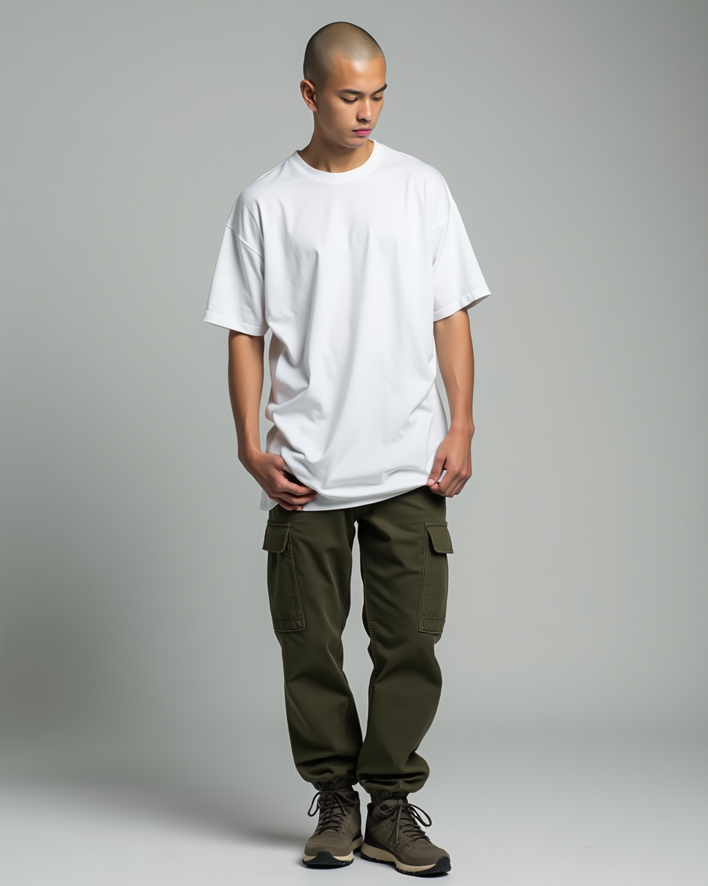
To showcase the apparel in context, I used AI tools and websites to generate models wearing the hoodies and t-shirts I designed. These visuals helped bring the brand to life on the website and added extra value to the user experience.
While the AI-generated results weren’t always perfect, I retouched the images in Photoshop where needed, I intentionally left some minor imperfections, as the focus of the project was primarily on web design and branding.


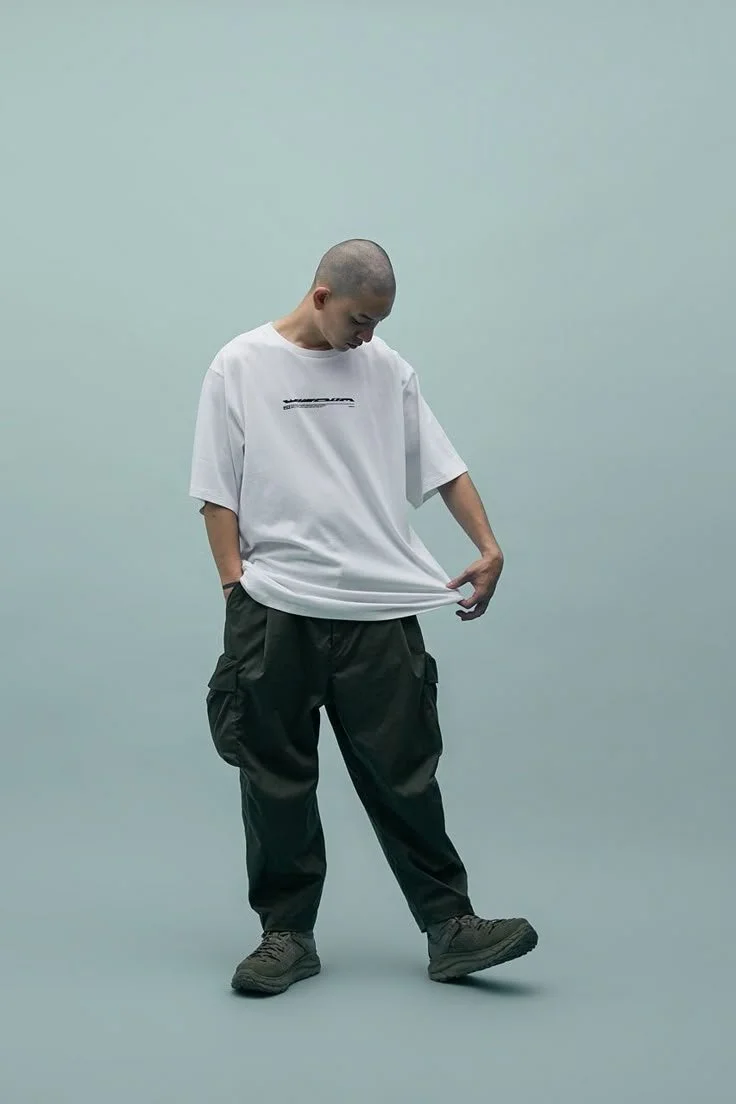
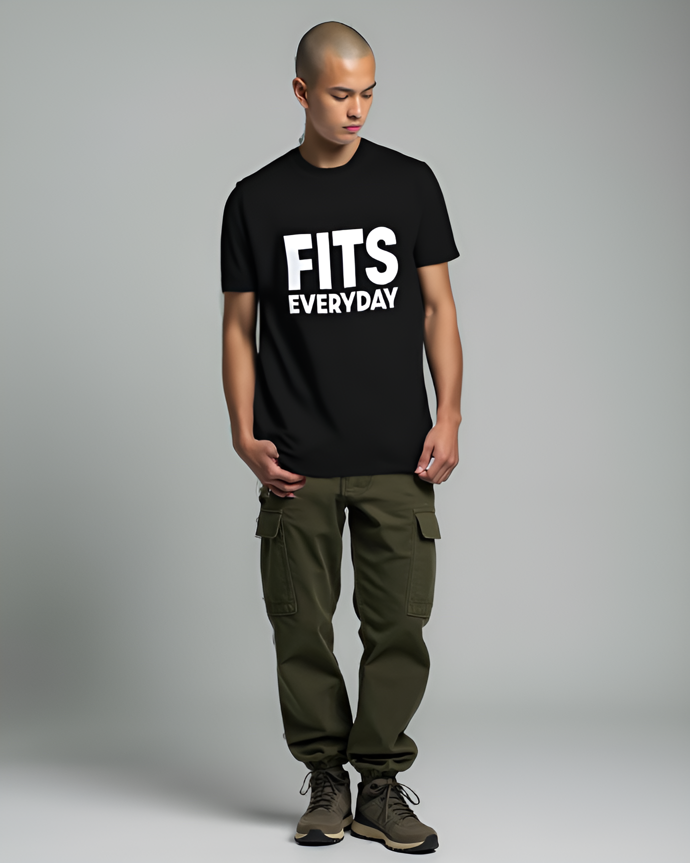

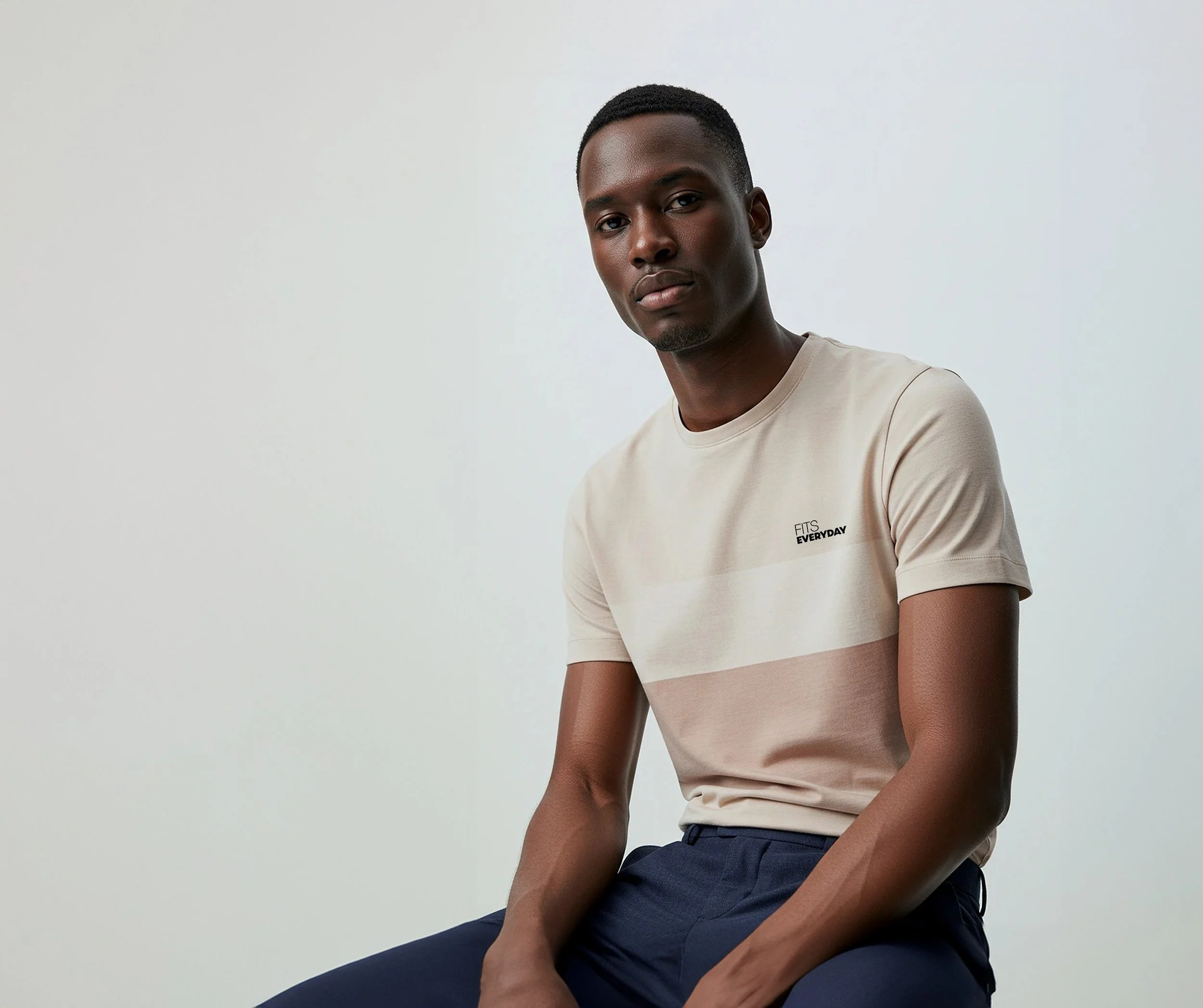
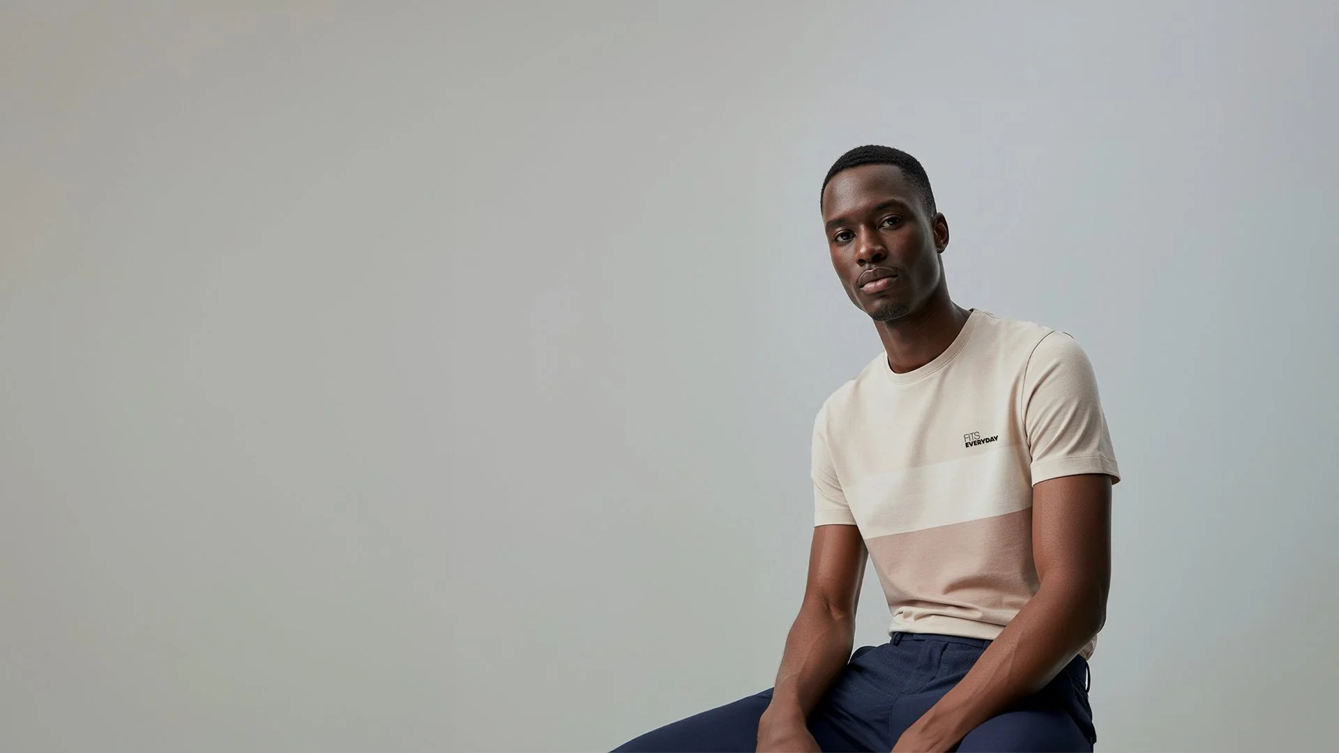
During the project, I found a modeling photo that matched the style of my brand.
I recreated it using Photoshop by editing and resizing the image to feature my own clothing design, incorporating it into the visual lineup of the collection.

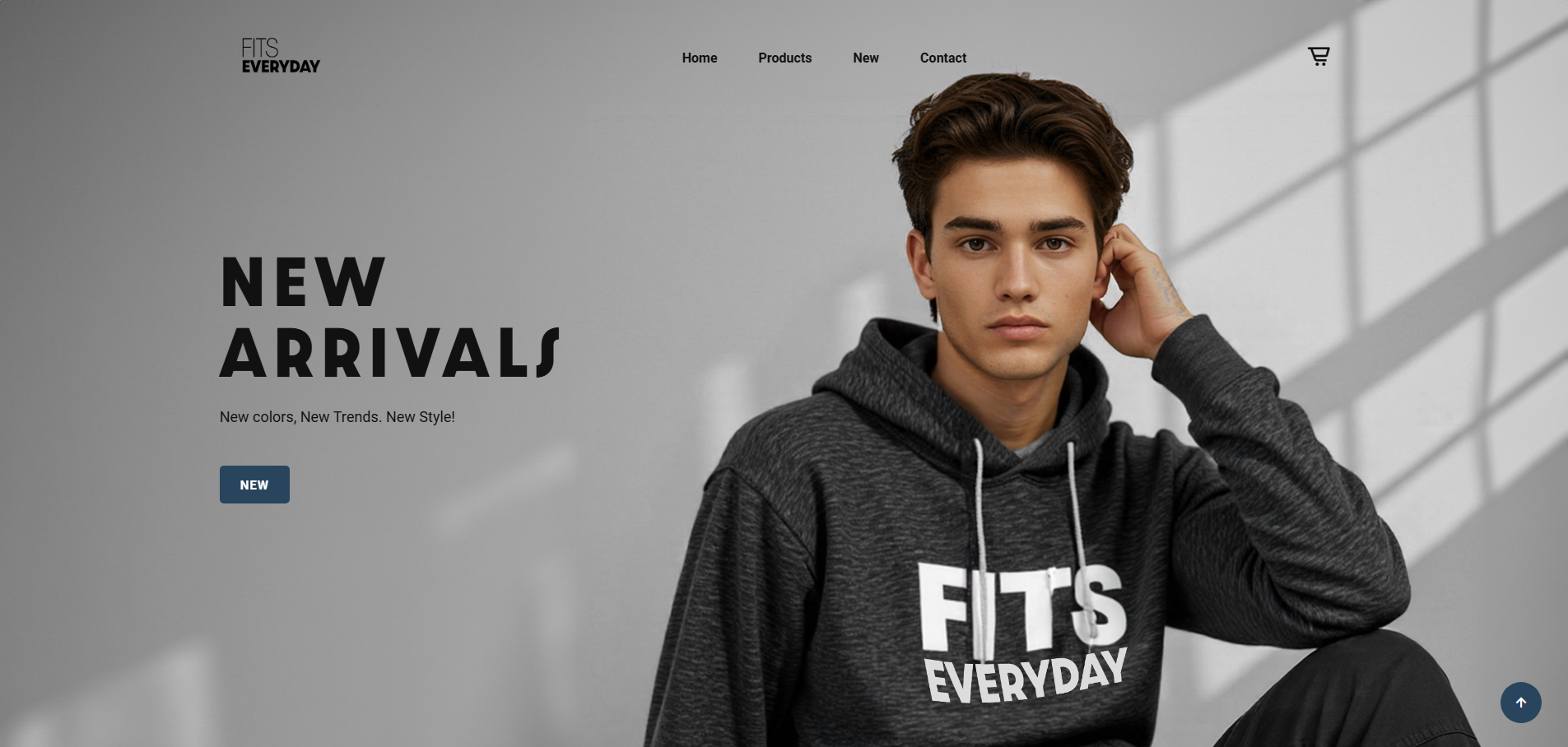
FITSEVERYDAY website UI, showing how the design looks across different devices.
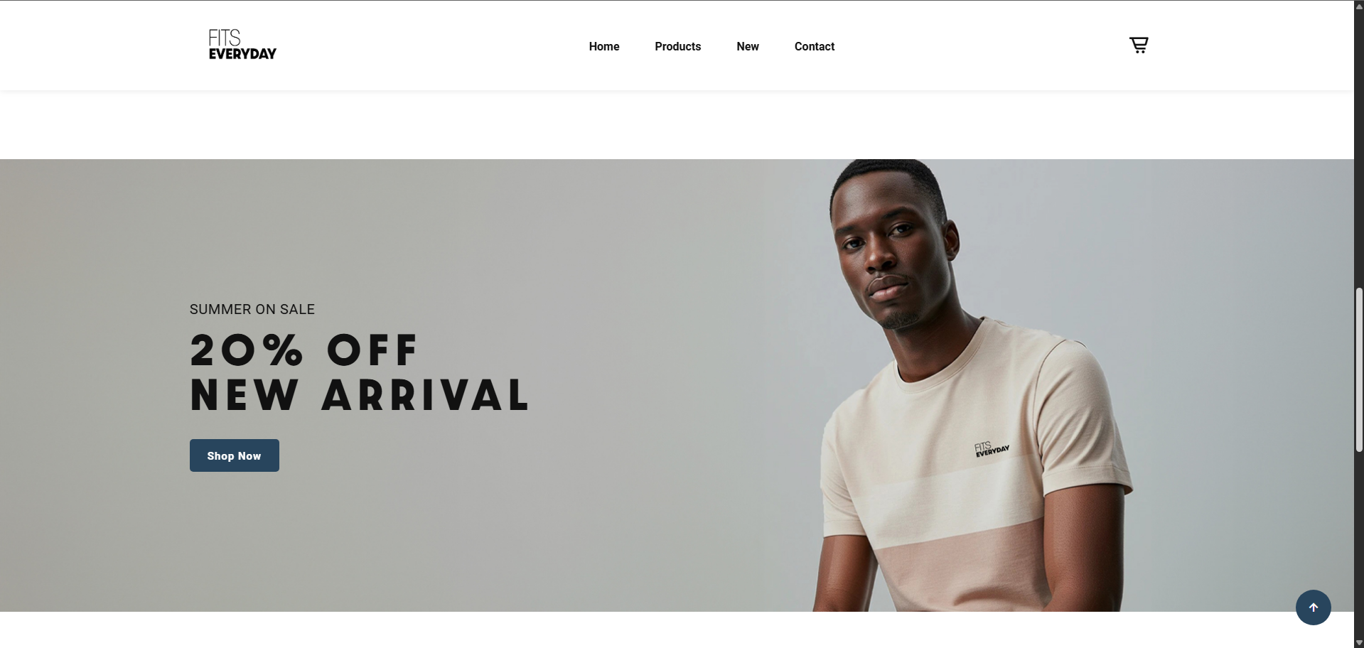
The homepage delivers a clear and engaging first impression. Bold typography, a focused CTA, and clean navigation make it easy for users to explore new arrivals and product categories without friction.
This section uses clear imagery and simple labels to guide users toward specific product types.
The centered layout and equal sizing create a balanced, scannable interface that encourages exploration without overwhelming the user.
This screen highlights a limited-time offer with strong visual hierarchy and a clear CTA. The layout keeps the user's focus on the discount message while smoothly guiding them into product exploration below. It's clean, direct, and conversion-focused.
The product grid is simple and scannable, with clear pricing, consistent layout, and a “Sale” tag that draws attention.
The footer provides quick access to key links and services, offering smooth navigation while reinforcing trust and usability.
Product Page – T-Shirts
This layout presents products with consistent spacing, clear pricing, and visual sale indicators, allowing for easy comparison. Category tabs at the top improve browsing efficiency and make filtering intuitive.
Product Page – Explore More (Hoodies)
The horizontal scroll in the “Explore More” section adds interactivity while encouraging deeper browsing. Paired with a sticky navigation bar and clean footer, the layout feels structured and user-friendly.